Wednesday 25 March 2015

8) G324 Targets

Evaluation Activity 8
What targets will you set yourself for G324 next year - when you will make a trailer?

Our main problem when filming our opening two minutes was the weather, not only was lighting a major issue but since we were filming in winter the cold temperatures were also an issue. We chose to go after school to film as it saved us having to find a weekend when we were all free and it meant we could talk about what parts we were going to film that day on our journey to location. Although this was a good idea, we failed to consider that as the sun set earlier and earlier each evening it meant we had even less and less time to film. We did later on in our filming consider starting all over again and filming it later in the evening so it was darker but there were only about 20 mins each day where the location was dark enough to look sinister and scary but light enough so the camera could still make out everything therefore we chose to stick with the footage we had. For next year I think getting a better camera would be highly effective, especially if we continue down the horror route as then we would be able to film in more low key lighting and create a more scary feel about the film. The cold temperatures were also hard to deal with as it meant our patience wore down quicker and we weren't as thorough with the amount of shots we should have used, we ended up getting a 'good enough' shot rather than striving to create something unique and interesting, in the opening I feel we got away with it as there is just about a large enough variety of shots but for the trailer next year I would really like to experiment more with shot types and stretch ourselves to achieve something extraordinary and unique rather than simply 'good enough'.

Another issue was we didn't leave enough time at the end of editing to add the titles in therefore this part of post-production was quite rushed and was were we ended up falling down. Aside from having to physically produce the titles we also had to re-research types of fonts used in horror films and re-watch opening two minutes to get some ideas as previously we had done very little research on this. This was quite time consuming and so from this mistake I've learnt to do more research whilst I have the time and to make sure there is enough time for all aspects of post-production (paying special attention to titles).

The non-diegetic sound in our opening I'm extremely proud of as i think the music makes the opening so much better, so much more tense and scary, it ties together all the shots perfectly and makes the audience sit in the edge if their seats in suspense. The only downside to sound is the diegetic sound - although the rustling of the trees, the snapping of branches, the footsteps and the squelching in the mud work remarkably well (very proud of them) the conversation between the three girls is the only down side. You can hear what they're saying but it would have been much clearer if we had re-recorded over it, this can be a target for next year to make sure any conversations or dialogue is audible to the audience.

Something that I think our group can improve on next year is planning, although we had a storyboard and had planned some of the shots we wanted when it got to filming and we all had varying ideas on how to do things we ended up realising maybe we hadn't put enough planning into it. The fact that we all had different ideas of how to do the shots showed how maybe we needed a more detailed storyboard or a more detailed script. This was a major factor when it came to editing as we hadn't included time scale on the shots (on the storyboard) or how many extra shots we could have in between so by the time it was all cut together the original draft was over 4 minutes long. This meant we had to lose quite a lot of shots meaning more effective planning could have saved all this extra effort. Dialogue was another issue as we hadn't planned this beforehand so came up with it on the spot. Although this worked out okay it took up valuable time, especially when the temperatures were that low. 

Overall I feel the group worked well to achieve a good opening, we completed our filming on time and only had to re-shoot a few shots, we were able to keep momentum up on the cold Sunday mornings so we could get some good shots but targets for next year would be:
1) Plan in more detail to make the filming part of production easier
2) Research extra things that could help with production whilst you have the time as you may be short of it later
3) Get a better camera so we can shoot in darker lighting and generally have a higher quality finish to the trailer
4) Leave enough time to complete post-production to a high standard (with special focus on titles)

Tuesday 24 March 2015

7) Preliminary

Preliminary Task
What we learnt in the progression from it to full product

When we started on our preliminary task we had little if any practical experience making a film , although we knew all the rules and regulations it was now time to put them into practice. Although we tried to create a visual appealing project we mainly used the preliminary task as practice to try out the basics like the 180 degree rule and the rule of thirds as well as experiment with a few different shot types. While doing our preliminary task we directed a lot of focus on continuity, we feel this is a key area of making any film good because without it the audience don’t feel as if it reflects real life therefore they cant engage fully in the story, therefore continuity was constantly thought upon during the entire course of making our horror opening. We have learnt so much from both analysing our preliminary task  as well as analysing other horror film openings, from doing this we were able to identify the areas where our preliminary lacked and we able to improve our knowledge and skills and then apply them to our opening. Areas we improved on were Shot reverse shot as the first time round it didn't go as well as hoped, we found it hard to replicate the same content twice and it emphasised to us the importance of having a script, or at least set dialogue. Shot reverse shot and match on action also involve the editing process, which has massively improved  during our film-making journey as we got more experienced with the way scenes should be cut as well as the software we were using.. Also for match on action we used the same idea for both projects as we felt it was easy and effective camera usage, we used a phone ringing, although it was the same we improved it second time round by adding non-diegetic ringing which made it clear to the audience that the phone was in fact ringing. Compared to our preliminary which included diegetic vibration noise which was hard to hear.

The production titles we used for our preliminary were non-existent and the opening part simply consisted of extremely basic titles listing some of the basic roles people had had in the task, this was due to our limited knowledge of editing at the time. Therefore we used editing software Sony Vegas which is simple, but had limited features making the produced footage rudimentary. Also during our preliminary everyone did everything whereas in our opening each member of our group had a specific job meaning our titles looked more official, more representative to real films. Finally during the production titles in the preliminary we just had a cloudy background to create interest and conform to the dark side of the horror genre but it is fairly bland and the audience lose interest in it quickly, whereas during the opening of our film we had already started playing the movie as the titles blended in at the bottom for the audience to glance at as they focus mainly on the characters.

As the months passed and we had done more and more editing we had gained enough knowledge to use Adobe Premier Elements editing software,  in turn this allowed us to mess around more with what sort of opening titles we wanted. We were able to pick a more suitable font as well as a better placement and size for the titles which made the overall look of it more professional.  From this we were also able to make a few production titles which in the end included "aspire productions” and “KSNH films”

Throughout our preliminary we had an extremely low variety of shots (mainly due to the short length of the finished project as a whole), the majority of them were medium shots although we did include a brief high angle shot and shot reverse shot. We concentrated on perfecting the 180 degree rule and making sure we applied it correctly to all of our shots, this is something which we continued to follow into our opening. As the weeks progressed and we evaluated opening to films, our understanding of shots became greater which we then applied to our opening, including an extreme long shot and extreme close up shots. After looking at our preliminary tasks shot reverse shot part we learnt from our mistake and improved it when filming our opening making it a smoother transition. This also emphasised another key point to our production - planning. 


In our preliminary we only briefly planned the dialog, we allowed our actors to make it up as they went, this is because we only had a short amount of time to plan and we didn't feel what was said was the most important thing, instead we concentrated on the camera skills. On the other hand during the planning of our official film opening we had a lot longer period of time to plan every detail so much more thought went into the dialog, how each word and how its said will affect the audience. We also produced a script which we published on our blog page as it showed that we had thought about it in detail.


Monday 23 March 2015

6) Technology used

Evaluation task 6
Technology used

YouTube is the worlds largest video sharing website. we used it to upload our opening two minutes (and add annotations at a later stage) , preliminary tasks , video diaries, etc. From using this I learnt about adding annotations and extra info to a video and so expanded my knowledge on how to use different types of technology.

We used blogger to make our blog pages, it was very easy to use and enabled me to produce a high quality blog page, I was able to  make it my own by changing the layout (adjust the widths etc), choosing the background, fonts, colours and adding certain features to make posts easy to find. This was a nicer way of showing our work than writing everything down on a pad. 

Adobe premier elements is the editing software we used when editing our opening, it has a lot of 'elements' to it such as effects , crop , cut , transitions which enabled us to create a high quality piece of work. Also when adding titles we were able to make it look more professional than if we had simply used a more basic product like windows movie maker. Although it was initially hard to edit as you had to learn how to use the software as soon as we'd watched a few tutorial videos we were able to use it effectively to create the opening we hoped to achieve. 


We used the school camera which is incredibly basic and not that high pixel quality but unfortunately we had no better alternative so we made the best out of the situation. Looking back on the finished product i'm incredibly happy with the picture quality and feel it looks good enough. The only down side to using that camera was we weren't able to film as late in the evening as we had wanted to (to create more suspense and conform more the the horror genre) as the camera couldn't see anything even when it got only partially dark.

Saturday 21 March 2015

Friday 20 March 2015

4) Audience

Evaluation: Activity 4
Who would be the audience for your media product?


Our audience would probably watch shows such as supernatural and post-apocalyptic TV dramas which have an unrealistic and suspenseful plot which gives them thrill and excitement (like in a horror film); they may watch these series because of the attractive characters. Depending on the audience’s taste they may listen to various music genres however majority of them will listen to different types of rock. They may like how it’s musically diverse and has loud vocals. Our target audience may wear dark clothing or wear the merchandise from their favourite horror film/drama. Our target audience would watch our film because it’s mysterious and it grabs their attention as soon as the opening begins, the music pulls them in with sharp rises in tempo and long notes which builds suspense, whilst the characters themselves are isolated almost immediately creating even more tension as the audience begin to wonder what will happen to them. Our opening also features techniques used in the horror films (extreme close up shots to hide surroundings and draw attention to facial expressions, fast paced editing to increase tempo of chase scenes, point of view shots to make the audience stand in the characters shoes) and includes intense music creating a thrilling atmosphere. 

Wednesday 18 March 2015

3) Media Institution

Evaluation Activity 3
What kind of media institution might distribute your media product and why?


[Transcript]

Why the various people are named in the titles - which jobs appear in the titles and in what order and how have you reflected this?
The first name that appears is the main character “Chloe Hicks” then “Conor Nelson” as the supporting lead character.  Then the extra characters are introduced “Amy Knight & Rashmi Sen” The directors and producers names appears as they’ve filmed it. We researched some titles and found that the important roles of the films e.g. main characters are introduced first and the least important roles appears later on.

What does the production company do?
A production company basically helps create the film by assisting with the budgeting, scripting, casting the characters and scheduling. They’re responsible for finding the right director and the characters with the talent required for the film however they’re also accountable if there are problems that affects the film e.g. the injuring of the main character. The production is involved with the film from the start until it’s fully completed.

The idea of a distribution and who that might be and why?
A film distributor is responsible for marketing our film, they usually set the release date and where the film will be exhibited and viewed. They can make it public by releasing the film in the cinema or it can be viewed at home by releasing DVD. We decided that we wanted Warner Bros as the distributor for our film as it distributes worldwide and had financial success. They have had partnerships with independent horror film companies e.g. Hammer Films Production.  We chose Warner Bro Distribution Company because we believe that it would fit our film requirements than other institution and it has handled a lot of low budget films in the past.

Where the money might have come from for a film such as yours
The UK Film Council will invest £20.2 million of public funds from the United Kingdom lottery into our film.

What is your film similar to institutionally (name some films which would be released in a similar way)
Institutionally our film is similar to Hammer Films Production because they are a British Film Company and specialised in the horror genre. This institution has a distribution partnership with successful studio such as the Warner Bro. Their success was due to the partnership which different   distribution company which lead to the Film Production with the financial success.
Woman in Black is similarly released as Hammer Films produced it then the film was distributed by Momentum Pictures which is an independent distribution company in the UK and Ireland.

Tuesday 17 March 2015

2) Key Character

Malevolent Phantom 
How does your media product represent particular social groups?


The two characters I'm comparing are Lucy from the Malevolent Phantom (left) and Dana from Cabin in the woods (right), there are many instant similarities that you can spot between these two, for example both are young, arguably naive girls who are not in very optimistic settings. Both seem troubled and anxious from the images above and it highlights how although they may put on tough exteriors inside they are deeply frightened and wary about the situations they are in. This conforms to the horror genre as it is conventional for woman to be isolated and alone as they are shown to be 'weak' and unable to save themselves from the situations they are in which leads to their inevitable demise. The audience would expect these scenes to be from horror films as there are remote settings and characters who are accessible to danger, are all connotations of a typical horror film. 

The main concept of our film is 'fear of the unknown' which means the identity of the phantom is unknown to both the characters and the audience. This is the same concept used in Cabin in the woods, this aspect creates more suspense as the audience are continuously trying to figure out who or what the antagonist is. Another striking similarity between the two films as a whole and these scenes in particular would be the presence of the woods, the looming darkness - both films use the twists and turns and the general spookiness and darkness of the woods to connote a more sinister, scary feeling about the film. Isolation and lack of civilisation are also very important factors in these two films as they create the tension and fear, if this took place in a city they could just call for help whereas in the woods they are alone and have no other people to call on for help. This appeals to the audience as it makes them place themselves in the characters shoes and wonder what they would do if they were in a similar situation.

Between the both films the costume is not very similar at all, whilst Lucy (left) wears more bright, radiant colours to highlight how she is a character of importance and also imply because she's being targeted her coat colours may suggest she leads a more vibrant exciting life - leading to her drawing more attention, more enemies, more reason to be targeted. Dana (right) on the other hand is in all dark colours connoting a darker side to her future and meaning she blends in with the woods so hopefully wont stand out.

* Spoiler Alert * Both characters signify an innocent and young person who is abandoned and lonely and will tragically die.

Monday 16 March 2015

1) Screen shots

Evaluation Task 1
In what ways does your media product use, develop or challenge forms and conventions of real media products (i.e of films openings) - Screenshots


 This establishing shot shows the audience the location the opening of the film will be set in, the light green of the trees contrasts the cold grey of the road and highlights how when she is with her friends there is happiness and safety but as soon as her friends leave and she enters the cold, darkness of the woods it signals things aren't going to be nice as before. The setting is also quite remote and away from civilization which is key as it shows how alone our main character Lucy is and how there is no-one around to save her or even hear her scream. 
We used a low angle shot to show that when the three of them are together they are safe and almost untouchable, it's a long shot as well with them in the background showing already to the audience how tiny and insignificant the characters are in comparison to the surrounding and how vulnerable they are with the trees looming over them. 
The original shot was quite long in length and showed them walking all the way down from background to foreground but we felt it dragged on to long and bored the viewer so to keep the pace up we cut it down to three shorter clips which we think is much more effective. 
This shot introduces the characters as we see them for the first time and we can begin to make assumptions about them - their costumes are a key part of this, the main character (Lucy) is wearing a bright, vibrant, colourful coat highlighting she is a person of more importance who we as the audience are likely to follow as something bad will happen to her, the other two are wearing very dull, plain clothes to signify they are supporting actors and not very influential in the story. 
The titles are in the bottom corner as we didn't want them to cover the whole screen as we want the audience to focus on the characters on screen, we chose white as the colour as we felt it looked more professional and we had liked how it looked in other horror openings, the font was quite simple but we made sure it wasn't too pretty or flowing (like a rom-com would have) but still legible. 
It conforms to the genre as it's young, innocent teenagers (specifically girls) in a remote setting on a gloomy, quiet foggy day - there is no one around to help. Also they appear quite happy which is usually how horror movies start before someone is brutally murdered and chaos descends.


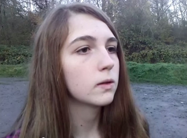
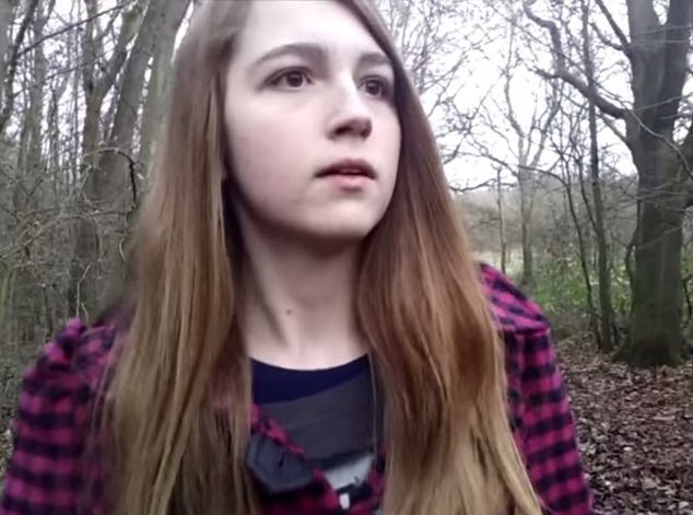
This shot is a close up of the main characters face, it shows the audience are getting closer to her as we learn more about her, also it hides a lot of the surroundings so the as the audience we are unsure if something is hidden behind her, to the side of her or lurking in the trees somewhere. This conforms to the genre as close up and extreme close up shots are often used in horror films, it brings the audience closer to the character and hides most of the surroundings they're in which builds suspense, it also has the effect of placing the audience more in the characters shoes so they feel the drama on screen is actually happening to them and draws them more into the film. This is something we wanted to make a key part of our film - placing the audience in the characters shoes, we do this through the use of many points of view shots when she is looking around or running and also by giving her prevalence and never cutting from her. The shots before this cut between Lucy (all alone) and her friends leaving (together, safety in numbers) and highlights clearly to the audience that she is on her own now., this conforms to the genre of having the main character alone in a rural setting (like the woodlands). Several shots before this showed her alone in the remote setting which built the suspense which acclimatized in this scene as the audience felt tense and unsure what was going to happen - this is cut sharply by the sound of a phone ringing, cutting the tension. 


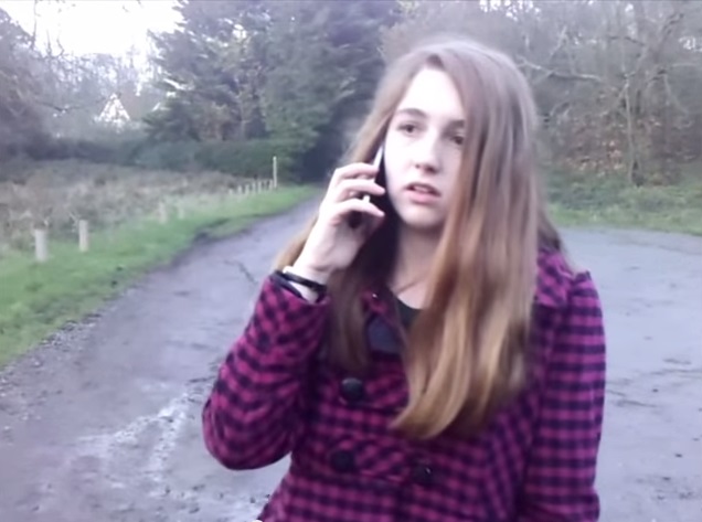
This is a medium shot which is used to again show the characters coat which is a constant visual reminder that something bad is likely to happen to her as it connotes danger and blood - key aspects of a horror film and therefore conforms to the genre. The phone (our only prop) shows her connection with the outside world as her mother calls her and is an important moment in the plot as it serves as the reason for why she has to walk through the woods as it's the quickest way home and her mother wants her home immediately. This could tie in with the coat that connotes danger as you could imply from the phone call that her mother wants her home immediately as she has done something bad that her mother wants to talk to her about. Without this moment Lucy would have probably gone the long way home, not through the woods and therefore probably wouldn't have been attacked and so the film would have no story line - this conforms to the genre as in most horror films people get attacked when they are alone and end up in remote settings even when it would be safer to go a different way. In the storyboard we put in that the phone would die (run out of battery) and therefore she wouldn't be able to contact anyone or get any help from the outside world but with issues on how long our opening was turning out to be we had to cut this shot from our opening. I don't think it affects the opening too much but i believe it would be better with a scene in the opening where the phone is dropped or something but it would have been hard to add this aspect into our opening, not only with timing issues but also with making it seem natural as part of the story and not staged just as a unnatural moment.


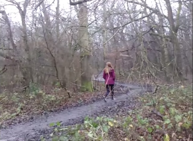
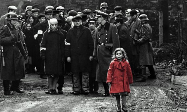
We took inspiration for this long shot, used to show Lucy entering the remote, dark, scary woodlands in her bright coat, from the film 'Schindler's List' in which there is the girl in the red dress. She represents something innocent which our character is and this scene could signify the fate of Lucy *Spoiler Alert* as in Schindler's list the girl in the red dress ends up dead. This scene conforms to the genre conventions as it shows an innocent, young girl in the isolated settings of the woodlands - there is a high chance she will be attacked and there is something sinister lurking in the background. We used a long shot which is unusual for this genre as it shows a lot of the setting which may decreases the amount of tension as people can see the surroundings and so it eliminates the possibility of something lurking in the background. With this shot though many things could be hiding in the woodlands and especially as it contrasts to her bright coat we thought we would break from the conventions and use a long shot. It also reinforces the key point we've tried to maintain throughout - Lucy is all alone and isolated from the outside world.


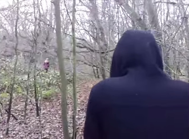
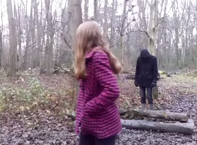
This is one of the few shots with both Lucy and the Malevolent phantom (MP) in it, this is something we kept limited as we wanted to peruse the idea that not only is Lucy truly alone but this MP is mysterious, we don't see him that much and don't ever really learn any more about him. Therefore we didn't want that many shots of him as we wanted to keep him hidden and mysterious. This scene is also one of the only scenes where the attention turns partially away from Lucy and onto the sinister person lurking in the woods, throughout the rest of the opening the camera is always on Lucy or shows the surroundings from her point of view as she is the main character and the person of importance. We used an over the shoulder shot so that we could still see Lucy and so the attention was never completely turned away from her onto the MP, also it shows us a bit of the MP to keep the audience hooked and almost give them something to reward them for holding on for this long, it's an important plot point as the MP has now been introduced to the audience and we want to know more about him. It also builds the tension as this shot emphasizes how big and powerful the MP is compared to Lucy who seems so tiny and vulnerable in this shot. 


This medium shot is effective as it shows the characters facial expression clearly and highlights how the audience should be feeling  - scared. A large proportion of the background is hidden which builds tension and plays on the classic fear of what's lurking behind you, by focusing solely on Lucy and giving her prevalence the hope is that by this point the audience feels like they are Lucy and are worried that there is something lurking behind them. Diegetic sound of leaves rustling can be heard which causes Lucy to become so alarmed and stop in her tracks. This shot is reasonably long in length as she steps onto camera and holds this terrified glance, the music is key by this point as it builds in tempo and volume, climaxing as Lucy turns around and we see there is in fact nothing behind her. This poses more questions than it answers as in the previous scene we had seen the MP behind her and we're now wondering where he has gone and if he's going to attack her.


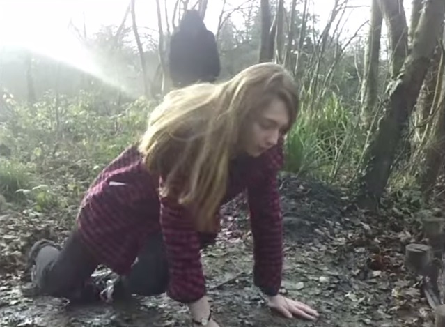
A medium shot is used to show the moment when Lucy finally see's' the MP that has been following her and her fear becomes real as she becomes scarred for her life. A long shot would have shown too much of the surroundings and meant there wasn't enough focus on Lucy and the MP and would have subverted from genre conventions as as previously stated horror films don't tend to use long shots as it reveals too much of the surroundings. A close up shot would have been effective to show her facial expression but it would have been hard to get the MP also in the shot so we felt a medium shot was perfect. Just after this moment non diegetic music is introduced that is high in volume and tempo as we want to audience to be scared for Lucy and worry whether the MP will catch her and kill her. Lucy's costume makes her stand out again in this scene whilst the MP is black to connote a sinister, scary character, the juxtaposition of these two colours works really well in this scene and highlights both the characters for different reasons. This is an important moment as all the build up, all the tension has built to this moment where Lucy finally sees the MP and has to then run for her life, the build up is effective as it keeps the audience on the edge of their seats, guessing what's going to happen next but from our audience research we found lots of people like a chase scene. The scene then cuts to a fast paced sequence of shots of Lucy running from the MP - providing the audience with what they want, a bit of excitement in the opening, getting straight into the dramatic side of the story rather than dwelling too much on characters backgrounds - we can learn about that later on once we have hooked the audience. 


After the high octane chase scene which concluded in Lucy falling to her knees in relief as she thought she had finally got away from the MP, we conformed to horror cliches and the genre conventions by having the antagonist appear and the protagonists fate look doomed. A low angle shot was used before to show Lucy in a high position at the time when the audience thought she was safe but as soon as the MP appeared in the background we cut to a medium shot showing poor Lucy about to be attacked, as before a long shot would have shown too much of the surroundings and not left enough focus on the two characters hut a close up shot would have been hard to position to get the MP visible in the background therefore we felt it was best to use a medium shot. If we had more time and some money to spend on this we would have loved to have got a much higher angle shot which showed Lucy's vulnerability and highlight her isolation in the woodlands. There was a slight issue with lighting in this shot as it shines in on the left hand side but when we went to re shoot it (along with a few other shots) we found that conditions weren't the same as it had been raining and therefore we couldn't use the re-shot footage as it didn't match with the rest of the shots. Never the less I feel it doesn't affect the shot too much and contrasts effectively with the dark, looking figure of the MP.


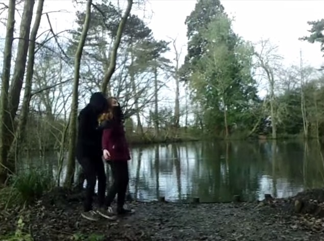
The final shot was originally longer in length but we cut it shorter, not only due to timing issues but also, because we felt it was more effective and more dramatic to cut to black after this screen shot rather than have the character dragged of the screen as we felt it was hard to make it look as brutal and scary as we were hoping for and therefore cutting to black was dramatic. The pond was supposed to represent her salvation as the audience finally thought she was safe and had escaped from the MP but it also highlights how isolated she is and reinforces the idea she is all alone and there's no-one there to help. This conforms to genre conventions as isolation is a key factor of horror films (used in 28 weeks later, The Purge, the Hole, Saw etc) and makes the audience feel more scared for the character as they have no-one to save them. This scene clearly shows the juxtaposition of the characters costumes as Lucys' coat is bright and radiant (with a hint of danger and blood) whereas the MP is black, dark and sinister. Lucys' coat is a dark red which stands as a physical representation of the darker side of her character and could be a hint of what could happen with her, unlike if she was just wearing a bright, colourful coat that would suggest her naivety and happiness, the darker shade of the coat suggests maybe she's not as innocent as the audience think and ties in with the plot line that questions how innocent the people the MP attacks truly are.

Wednesday 11 March 2015

Audience Feedback


The audience feedback was very important as it let us know what parts to improve on, it was also the first time people had seen out opening so it was good to hear what parts they liked about our opening as well as some things to improve on. Our main criticism was the font used at the end, '48 hours earlier', as many felt it didn't conform to the genre and looked too much like a rom-com - this was good for us to know as now we know how to improve for next time.

Wednesday 25 February 2015

Monday 23 February 2015

Editing Diary

Malevolent Phantom
Editing Diary


Starring: Chloe Hicks & Rashmi Sen
Filmed by: Amy Knight


Monday 16 February 2015

Practice Production titles

Malevolent Phantom
Practice Titles


48 Hours Earlier – Gabriola
48 Hours Earlier –Tempus Sans ITC
48 Hours Later – Nyala
48 Hours Later-Orator Std
48 Hours Later-Prestige Elite Std

48 Hours Later - Viner Hand ITC


Friday 13 February 2015

Thursday 15 January 2015

Opening Titles Analysis (Research)

Malevolent Phantom
Opening Titles Analysis


To help us in designing our own opening titles we analysed some horror films opening titles to get an idea of what works and what will look good for our production. The first film we looked at was cabin in the woods, they used red titles that connotes blood and danger, this is an interesting look for a film as most of the time the titles are in white or black. The red contrasts the plain, simple colours usually used in films and leads the audience to believe the film will have a lot of blood and death in it. They are placed off center which  is more aesthetically pleasing than them just being placed in the middle, this coincides with the rule of thirds which  suggests that each image should be divided up into nine equal sections (two evenly spaced horizontal lines, two evenly spaced vertical lines) and that important compositional elements should be placed along these lines or their intersections. This technique is useful as it's claimed that placing a subject with these points creates more tension and interest in what's on screen that simply placing the subject in the centre of the screen. Therefore I would probably copy this design pattern and also have my titles placed on these 'lines' or their intersections to make my titles more interesting and appealing. 


Another set of opening titles this time uses white text which I think looks more professional and still holds an aspect of horror about it. Red text can look cheap and unprofessional so I think we will use white text instead, therefore we can have a black or red background and the colours wont be contradicting and the white will stand out. This set of opening titles also uses the rule of thirds with the titles being placed in the low corners of shots and off centre, this reinforces how much better titles look if placed off centre and so I think it would be a good idea to copy this. The titles are quite small so not to drag too much attention away from the shot which I think is key but they are large enough and of a bright enough colour and clear enough font that they stand out and can be noticed by the audience. They are aesthetically pleasing to look at too as they glide over one another with a subtle enough movement that it doesn't steal the scene away from the focus of the shot but stands out enough to be noticed, also the font is clear to read so not to confuse the audience.

Out of all these features I think it is a good idea to have white text as red looks unprofessional and black would be too dark to work on any shots, especially horror as the scenes are likely to have low key lighting so the text wont stand out. Also coinciding with the rule of thirds and placing the titles off center is a good idea as it makes them look better and have a more interesting look for our film, as well as that having a large enough font is key so the titles can be read but not too small as you don't want them to overshadow whats going on in the scene. Another important factor is a clear font, nothing too swirly or jagged - simple but unique font to coincide with the appropriate colour, size and placement.

Tuesday 6 January 2015

Checklist


Done?
Comment?

RESEARCH

Overall well detailed analysis and well commented on what didn’t work out and why and what you could do instead. J
Genre Research and mind-maps (3 posts)
YES

Uploaded YouTube videos of openings – analysed (10 openings)
YES
You have a well detailed evaluation for each opening two minutes using key terminology.
Opening titles analysed in detail – font researched
NO

Uploaded YouTube videos of similar genre openings analysed in detail (3 posts)
YES

Costume and location research – google earth and pictures you’ve taken. (At least 2 posts)
YES

Actors and props photos and interviews
YES

Soundtrack research (non-copyright music)
YES

Audience Research and Profiling (typical audience member and similar films)
YES

Institution research (Paramount etc)
YES

Certificate research
YES


PLANNING


Own film idea brainstorm
YES

Own film treatment
YES

Relevant Online Tutorials (on filming and editing) and Comments (At least 2 posts)
YES
Well commented on each tutorial.
Documenting of influences on production
YES

Shot lists
YES

Consideration of representation in your film and stereotyping – use theory from G325.
YES

Questionnaire (and feedback) Get some feedback on your initial ideas!
YES

Diary of filming/editing etc with photos and screen grabs (At least 3 posts)
YES

Mood board
YES
Good explanation of what the images in your mood board are representing.
Script


Practice titles created and uploaded


Storyboard – animatic.


Time Management Schedule – what you did& when, problems you encountered& solved


Codes and Conventions featured in your Opening Two Minutes


Ensure that all posts have a title, detailed comments and relevant pictures which are commented on.
YES